Showing posts with label Botanical. Show all posts

Monday, October 24, 2011

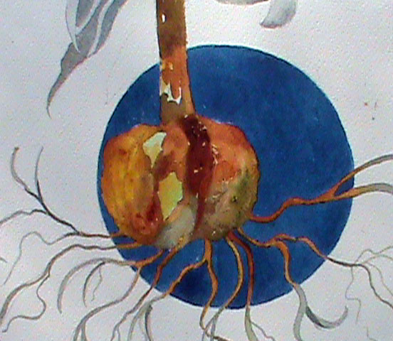
Blue Moon Fritillaria

I really Love this plant. It was painted  by breaking borders and letting some of the plant's leaves and roots run into the white background.   I also love playing complementary colors against each-other-- in this case blue and orange.

 This is only one of the designs I will feature in a class on design coming up at Maryland Hall in the Spring.

I actually had as much fun with the bulb as the flowers!   This is not a plant that is painted very often. Give it a try!


Friday, June 24, 2011

Lesson #62- Forgiveness is My Function As the Light of the World

This is another example of the use of negative and positive space using geometric design. What cannot be seen is the framing. The mat is covered with  a prayer from the Course in Miracles - I have written this prayer is calligraphic script which I love almost as much as the painting process.  The prayer reads: "It is your forgiveness that will bring the world of darkness to the light".    It goes on to say "Remember that in every attack you call upon your own weakness, while each time you forgive you call upon the strength of Christ in you."

For more information about the Course in Miracles , go to ACIM   or The Foundation for  Inner Peace

Monday, June 6, 2011

Using negative space in the background

The first image is a close up of the under-painting. This one has lots of yellow-orange, yellow, blue, blue-green, and yellow-green. Creating am interesting under-painting is the key to success in any negative painting.  Making sure the blues and oranges don't gray each other down is also challenging.
The second image shows some detail in the foliage surrounding the flowers.  Both negative ferns ( the light areas which were painted around the already existing underpainting) , and the positive ferns ( added on top in a darker pigment)  are clearly shown.
The final painting turned out well. I was happy with the changes in color  in the background. Variety is always a key to success in any painting in any medium. I glazed a few places with Daniel Smith's Luminescent Bronze. You can't see it in the photo but in person it adds just enough sparkle.