Wednesday, December 14, 2011

White Roses on an acrylic Underpainting


This is a fun way to paint but takes a little practice I covered the surface of my paper with  the three primary colors - Red, Yellow and Blue. I let the colors blend together. Once the under painting was dry I used a template in the shape of the roses and lifted up the color to reveal the white flower.  After lifting color off the surface of the paper,  I added the shadows to define the petals. It was a technique demonstrated at the Annapolis Watercolor Club by Susan Herron. Take a look at her work to see a professional rendition  of the technique.

Saturday, December 10, 2011

Connecting Color and Shape

This painting is called Connemara. This is one of my favorite places in County Mayo, Ireland. Sometimes I refer to this painting style as a collage because different images are woven into a cohesive single painting. It is not easy. Color, shape, and negative painting  are the glue that holds it together. In May I will be including this type of design in  workshop at Maryland Hall For the Arts in Annapolis . The workshop is in May and is all about design and negative painting.

Monday, October 24, 2011

Blue Moon Fritillaria

I really Love this plant. It was painted  by breaking borders and letting some of the plant's leaves and roots run into the white background.   I also love playing complementary colors against each-other-- in this case blue and orange.

 This is only one of the designs I will feature in a class on design coming up at Maryland Hall in the Spring.

I actually had as much fun with the bulb as the flowers!   This is not a plant that is painted very often. Give it a try!


Monday, October 17, 2011

Getting Ready for Floral Watercolor #2 in the winter term

Registration has begun for  Floral Watercolors. This class builds on the first semester inwhich we focused strictly on painting a single flower.    Now the flowers will be included in a complete composition.   Here is an example of a challenging composition featuring yellow orchids.  The class meets Thursday nights from 6-9 in Edgewater, Maryland. Go to http://www.paintpencil/ for all the details!

Saturday, September 24, 2011

Painting Vegtables and Eating them too!!!

I painted these radishes today as one of the projects for my beginner class next spring.  If you look carefully you'll see hints of pink shining through a dark, glossy black background.  This adds interest to a background that can end up flat. I'll teach you how to do it. 

I love vegetables and am a vegetarian of many years. I recently  turned vegan. I have traveled all over the United States teaching, and on my travels met many women with health problems. I am concerned that they do not know how to eat. In the United States we have become dependent on packaged foods.  If you read the label there are many words you can't pronounce. If you can't say them, please do not put them into your body. 
 There is a myth that eating meat is the only way to get protein when many vegetable's have more!

Some women believe that calcium builds bones but recent research has shown that this is not true.

Food is medicine......choose whole, plant based foods.  Dieting is totally unnecessary if you eat a plant based diet.
 Read-- "Forks Over Knives."  This is a new book and movie about a plant-based diet. You can click on Amazon Books  on the right and buy it now. It could save your life.


Monday, September 19, 2011

Color Family #4 ready to go!
Showing the Color Clock and how easy it is to use. If you missed this class at Maryland Hall For the Arts keep your eyes on http://www.paintpencil.com

Sunday, September 11, 2011

Having some fun with Color and Design

 Some of  you will  have the opportunity to  paint this design in a color family of your choice next weekend in my Color Clock Class.  It is important to play with color and shape. Forget about having a finished painting suitable for framing.  You will never learn if you don't free yourself up to fool around for the pure fun of it.  This is  a step by step rendition of a simple design, It is Color Family #9 which is yellow, yellow-orange, orange, red-orange and red. Blue is the   complement of the family.   This may look easy but it takes alot of time and thought. I started with an original     drawing, but as I used darker values in  later stages of layering I made up the shapes.

This is the under-painting
Starting to define the shapes


Coming along

Getting Closer but I need those important dark values


Finished!!!!! I fussed on the last steps. It is an intensely warm painting.

Monday, September 5, 2011

A Painter and a Hurricane

I had no idea how frustrated I would be the week Hurricane Irene hit us here in Maryland!   We lost power for 7 days!   On the first day I got a little excited thinking that I would  get lots of painting done during the day. After all, there would be no meals to cook and cleaning was out of the question.TV wasn't an issue either.but I would miss the radio.

So the first day I went to my studio and realized my water buckets were dirty. UH OH--- we are on a well that isn't working... and our tub held all the water for the week--- did I dare take that precious water out. I did the first day.  

The second day  I finished a new drawing-- I placed it on my light box in order to transfer it to the watercolors paper and quickly remembered it wasn't working.    The water became a bigger issue--- day 2 and we  lost the second bath tub holding water.

Ultimately I gave up-- I  dump my water buckets frequently and  I knew it was taking a chance to use water for my pleasure when toilets were more important.   

The ultimate frustration--- the power went on 7 days later with a teaspoon of water left in the tub and I came down with a chest cold.    Needless to say, I am watching the weather channel and praying the rest of the bad weather goes out to sea!   Hope the rest of you had a better experience with Hurricane Irene.  Happy painting Jane


Thursday, August 11, 2011

Workshop : The Color Planning Secret and A Taste Of Negative Painting

This workshop is open to all painters regardless of your painting medium. My simple color theory will change the way you choose color and eliminate muddy results.
Date:  Saturday, September 17 
Place:  Maryland Hall for the Arts in Annapolis
Time:  10 am-4pm
Cost : $45 for members and $70 Non-members
Go to http://www.mdhallarts.org/   to register

In addition to color I will be offering a taste of negative painting. Each participant will get a wonderful booklet full of great hand-outs and worksheets.

Tuesday, August 9, 2011

The True Self

This is a good example of a negative painting done with a limited palette.--notice the circular arrangement of the colors. 

The title comes from the Course In Miracles. White lilies represent purity  and they are at the center of our being. Our true self is what is left after we subtract our egos.  This true self  is our real self.   It is hard to see and connect with the true self because we carry so much in the unconscious we are not aware of.   Judgements also get in the way of seeing the true self and in the world we live in judgements are hard to escape.

Many of my paintings come from my desire to ask spiritual questions and seek answers. These issues are reflected in the way I portray my subjects.  Sometimes I call these  watercolors painted prayers.

Wednesday, July 6, 2011

The Illusions of the Ego

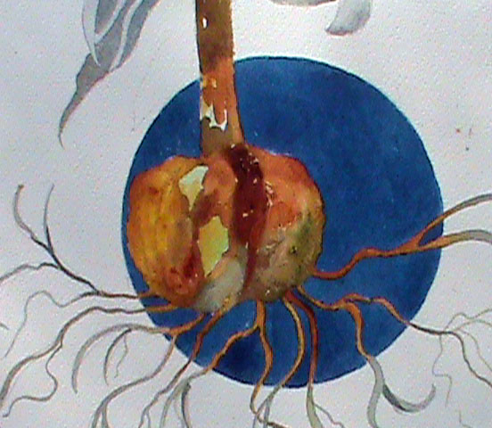
This is another painting inspired by my favorite book, The Course In Miracles.   The title comes from Chapter 4. It says, You can change your mind. When your mood tells you that you have chosen wrongly, and this is so whenever you are not joyous, then know this not to be.

I have experienced this myself many times. I can be very angry at something that happened to me that day. I stop for a moment and remember that I create my own reality and I don't have to be upset. I simply change the way I think about the situation. In other words I change my mind and turn anger into peace.

Sunday, July 3, 2011

Carrie's Flower

This is a good example of what I call "broken borders".  Once this painting is framed the rounded shapes breaking into the colored center will be more prominent. It is like painting a puzzle and I just love the process.

Friday, June 24, 2011

Lesson #62- Forgiveness is My Function As the Light of the World

This is another example of the use of negative and positive space using geometric design. What cannot be seen is the framing. The mat is covered with  a prayer from the Course in Miracles - I have written this prayer is calligraphic script which I love almost as much as the painting process.  The prayer reads: "It is your forgiveness that will bring the world of darkness to the light".    It goes on to say "Remember that in every attack you call upon your own weakness, while each time you forgive you call upon the strength of Christ in you."

For more information about the Course in Miracles , go to ACIM   or The Foundation for  Inner Peace

Saturday, June 11, 2011

Orange Lilies

This is a good example of negative and positive use of the space. This approach is very controlled by creating a carefully thought out under-painting ahead of time.  The orange lilies in the top square are the center of iinterest.

Monday, June 6, 2011

Using negative space in the background

The first image is a close up of the under-painting. This one has lots of yellow-orange, yellow, blue, blue-green, and yellow-green. Creating am interesting under-painting is the key to success in any negative painting.  Making sure the blues and oranges don't gray each other down is also challenging.
The second image shows some detail in the foliage surrounding the flowers.  Both negative ferns ( the light areas which were painted around the already existing underpainting) , and the positive ferns ( added on top in a darker pigment)  are clearly shown.
The final painting turned out well. I was happy with the changes in color  in the background. Variety is always a key to success in any painting in any medium. I glazed a few places with Daniel Smith's Luminescent Bronze. You can't see it in the photo but in person it adds just enough sparkle.

Sunday, May 29, 2011

White Roses

 This is a close-up of the leaves in the painting below. Before painting the leaves it was necessary to place an under-painting of interesting colors. This under painting shows up in the veins after  they were painted in a negative fashion.
 I love painting white roses..... They may look white, but the petals are actually almost 75% tinted with blues, purples, and rose pink. It is difficulty to see in a picture, but the yellow is a  Daniel Smith pigment called Iridescent  gold . This color actually sparkles.  


Friday, April 29, 2011

Painting Outside The Lines

This painting is titled "Lily In The Pink."  It is a good example of  techniques that I love and teach. The interior pink shape holds two white lilies that are painted directly.  When the lilies cross the border of the pink square (called breaking borders)  their colors change and they join the background shapes which are painting negatively.  The combination of positively and negatively painted shapes makes for an interesting and unusual composition.